External Auditing
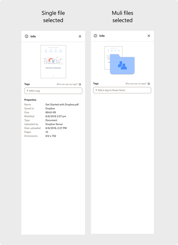
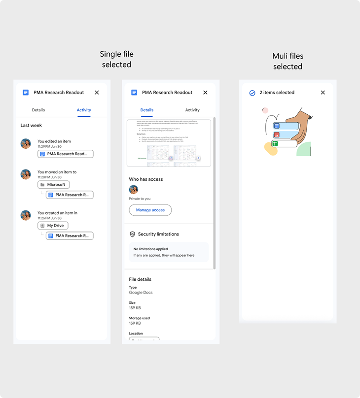
I conducted an external audit of Google Drive and Dropbox to understand how comparable products present file details and metadata, identifying patterns and opportunities to inform the OneDrive redesign.
Rearchitecting the Information Hierarchy
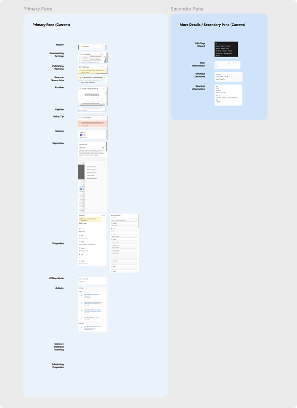
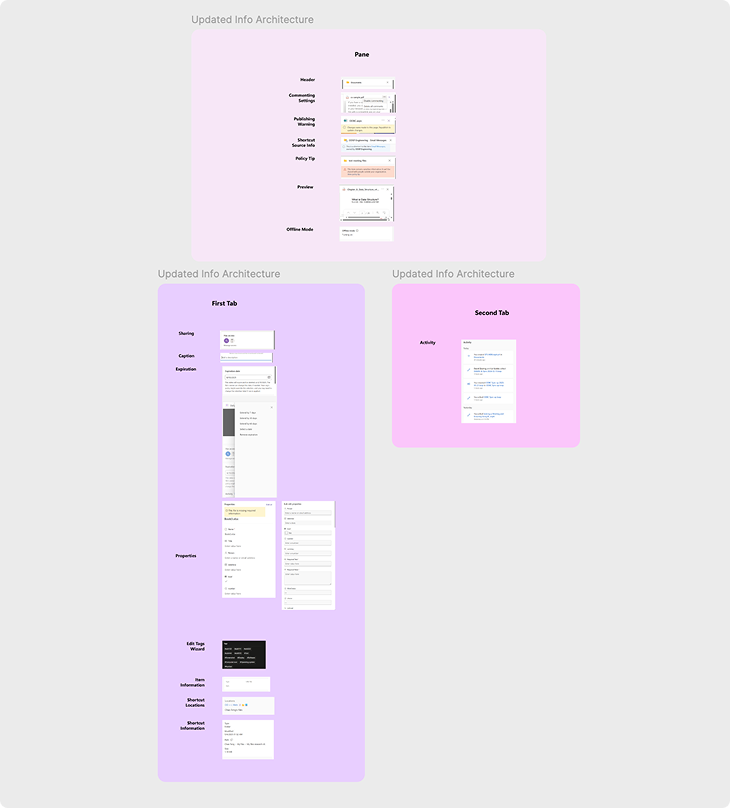
I partnered with the engineer to document the current information hierarchy in Figma, then re-architected it into a proposed structure that became the foundation for my design explorations.
Design Explorations
Using the proposed information architecture as a foundation, I began exploring layout and interaction patterns for the new Details Pane. I developed four distinct design options, each testing different ways to organize content, prioritize information, and support user workflows.
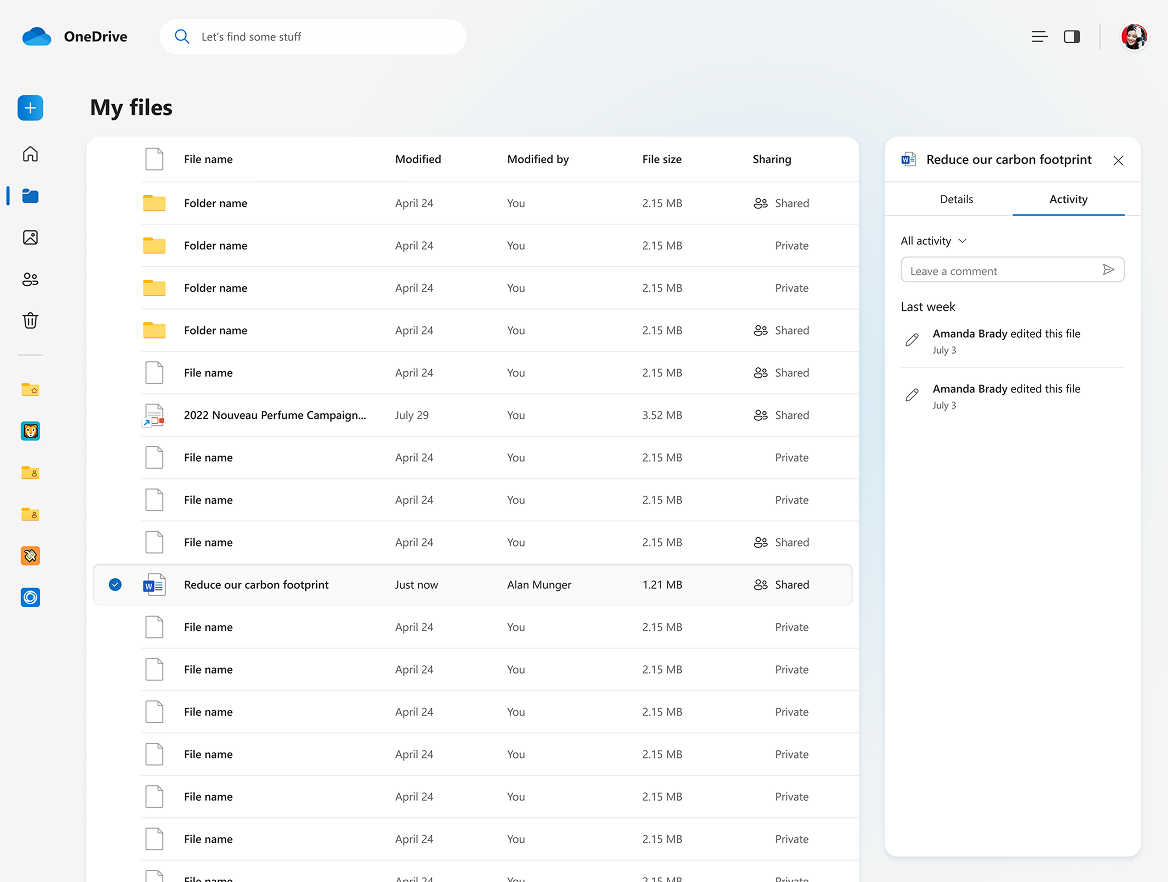
Option A: Two-Tab View
Benefits:
✅ Prioritizes Details upfront
✅ Maintains familiar interaction
Tradeoffs:
⚠️ Limits discoverability of second tab
Option B: Condensed Tabs View
Benefits:
✅ Improved scannibility of tabs
✅ More intuitive and common UX pattern (ex. Google Drive)
Tradeoffs:
⚠️ Losing visual preview when switching tabs can be jarring
Option C: Visual-First Details Pane
Benefits:
✅ Clear file identity
✅ Immersive feeling
Tradeoffs:
⚠️ Not optimal for non-visual files (ex. spreadsheets, word documents, folder)
⚠️ Visually overpowering vs. metadata
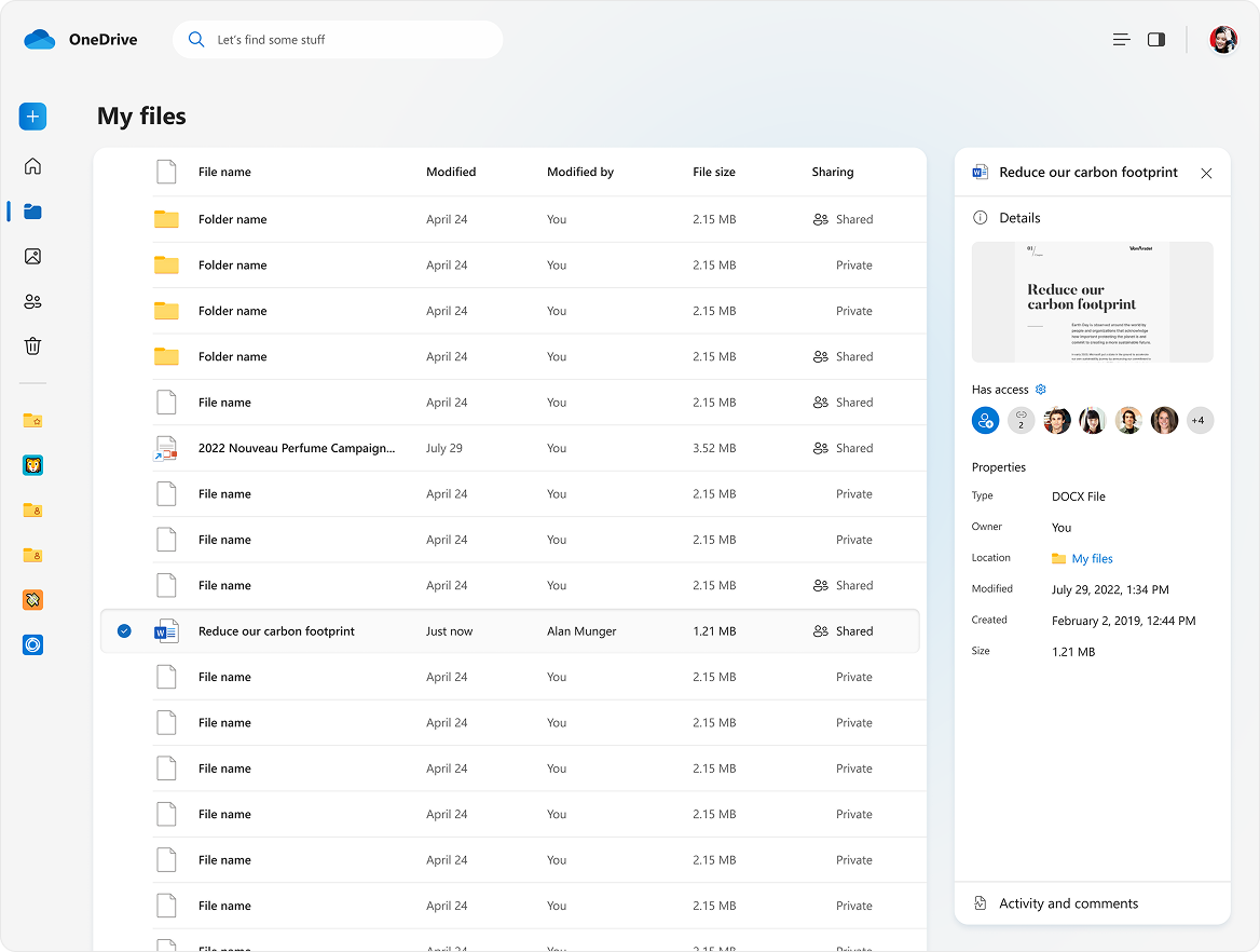
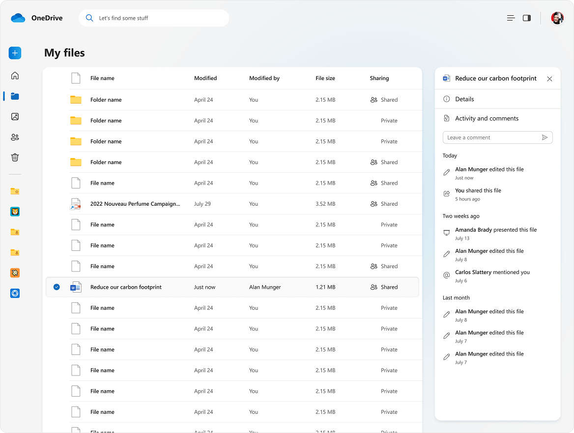
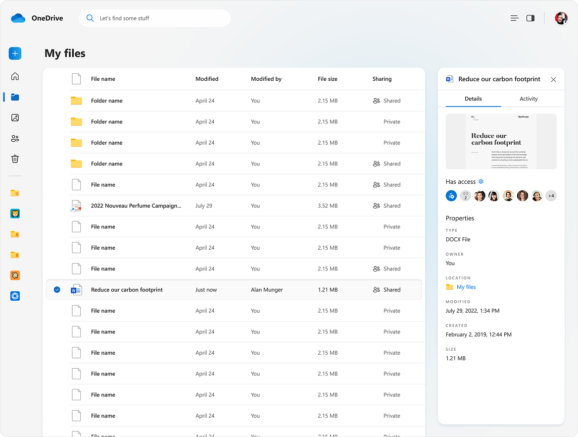
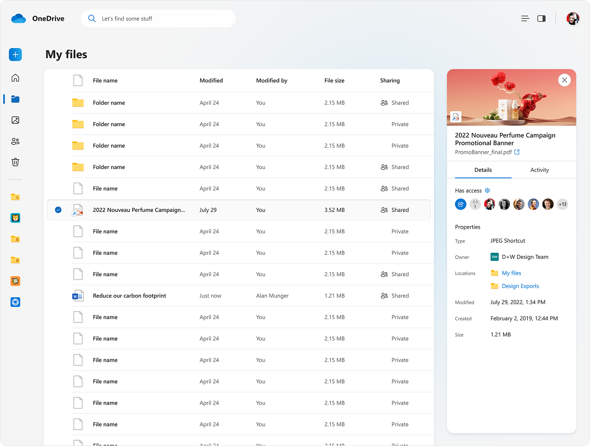
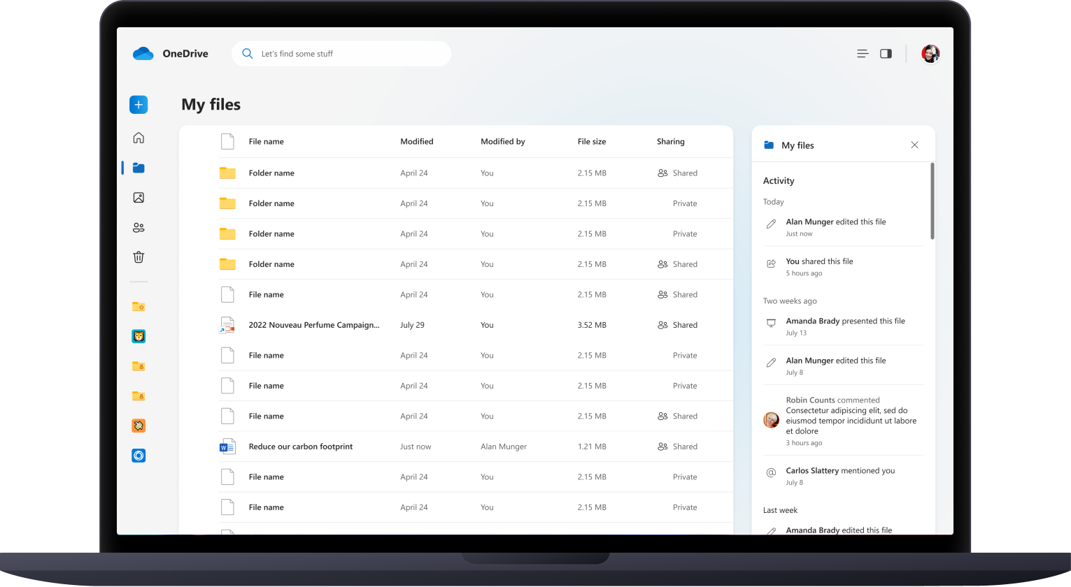
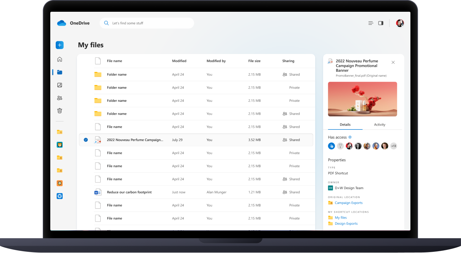
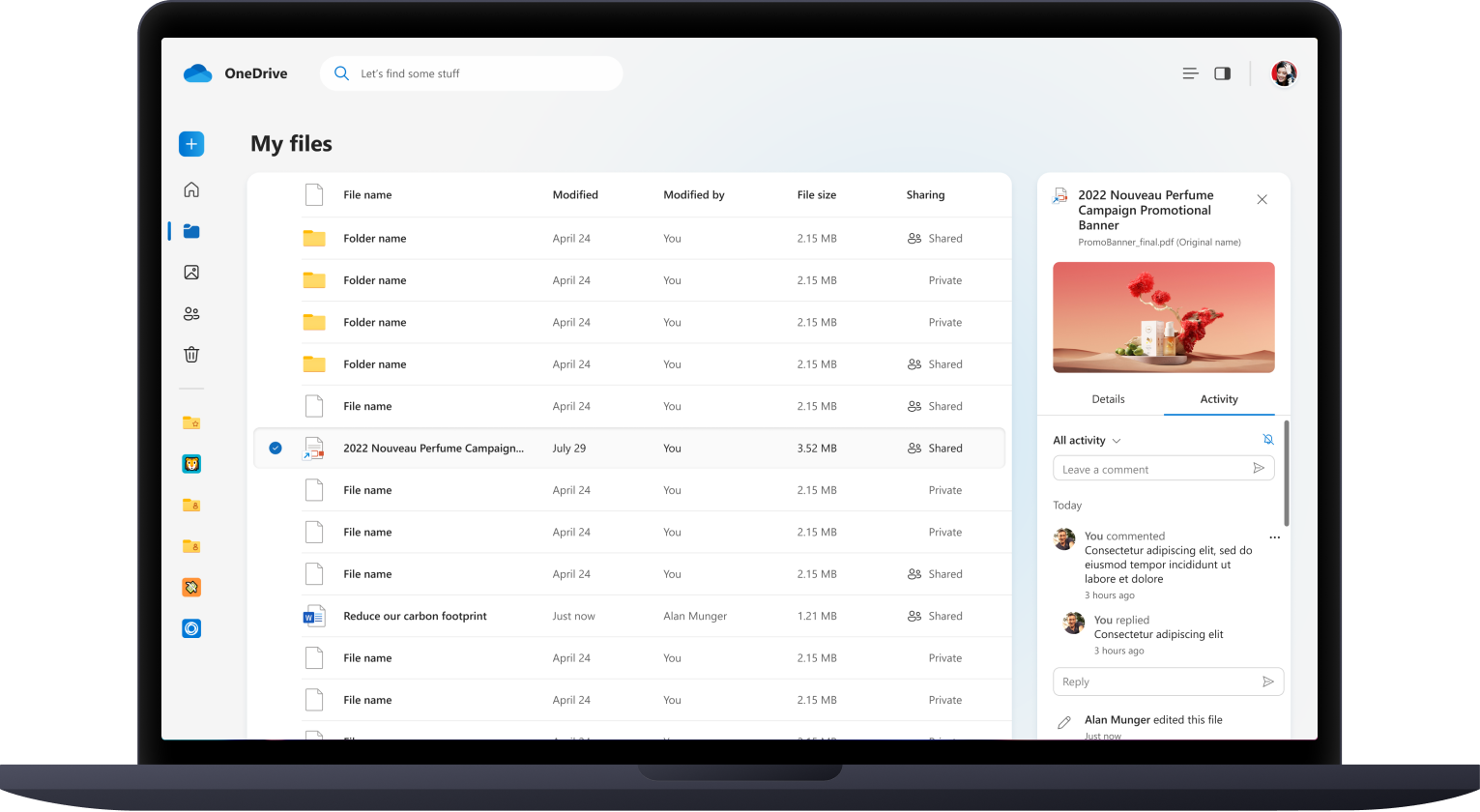
Option D: Details Pane with Preview
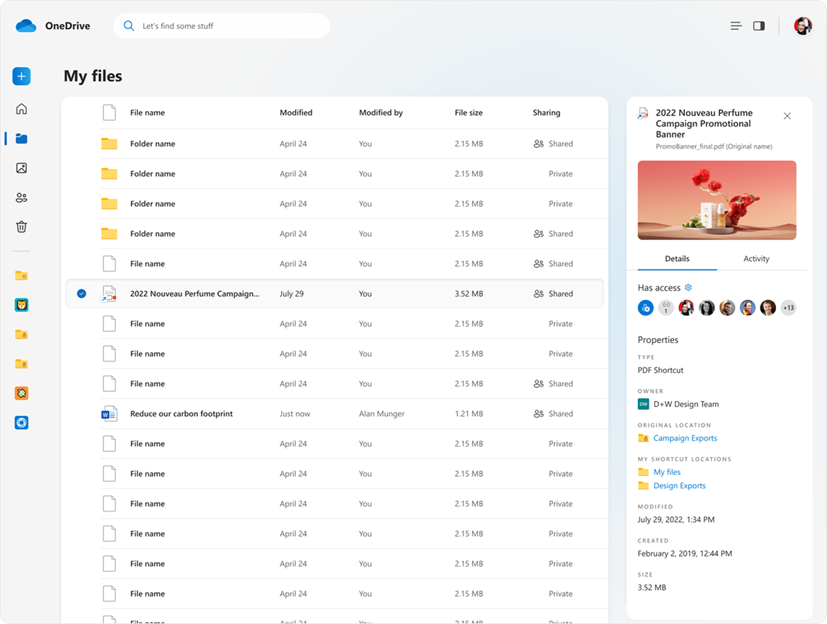
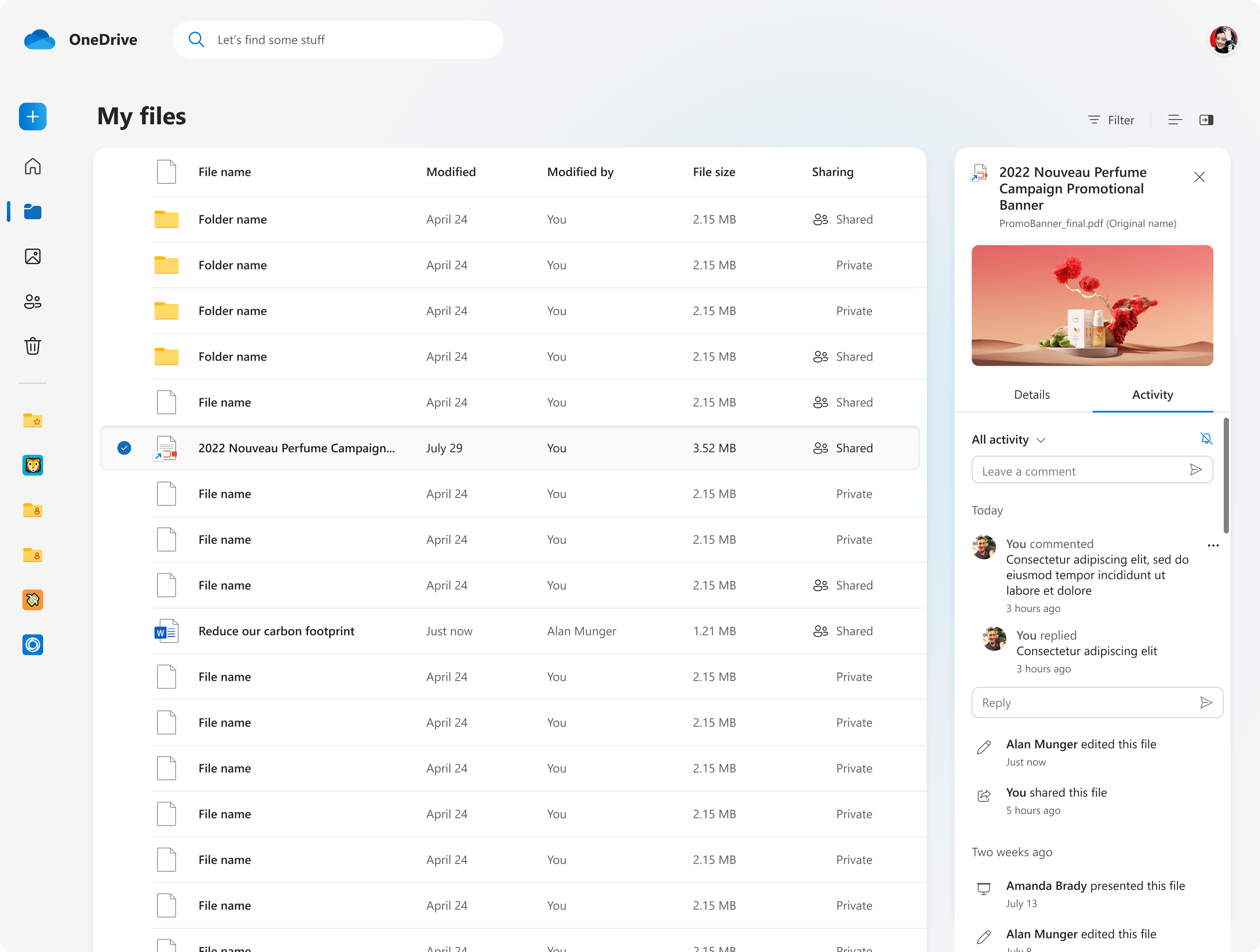
Benefits:
✅ More intuitive visual hierarchy
✅ Not as visually overpowering vs. metadata
✅ More optimal for non-visual files
I mapped the design options on an impact–effort matrix to evaluate their potential value to users against the resources required to implement them. This exercise helped me quickly identify which options balanced high user impact with feasible implementation.
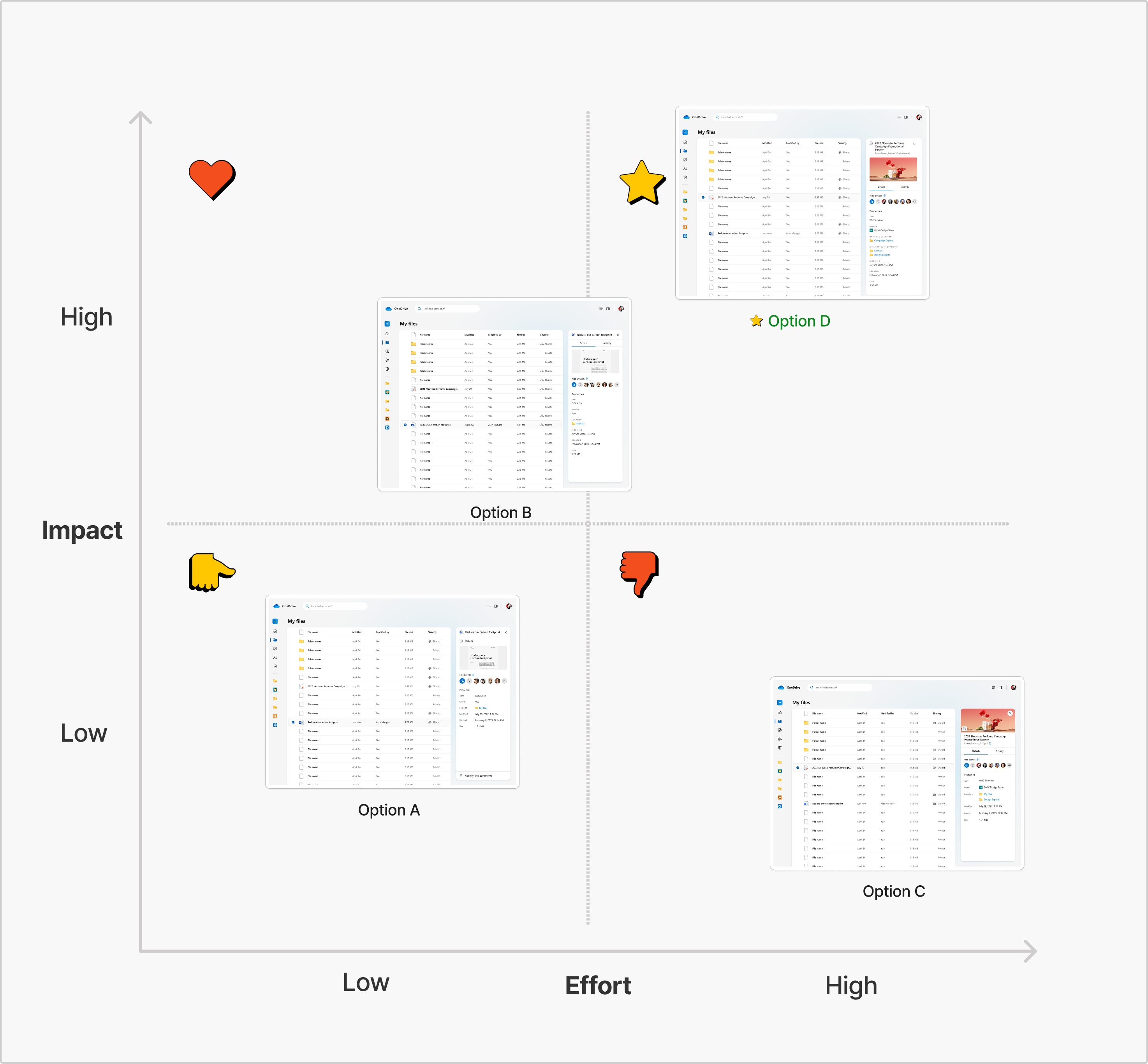
Based on this analysis, Option D emerged as the strongest candidate, offering significant usability improvements without introducing major technical complexity. I then explored additional use cases to validate and refine this direction.
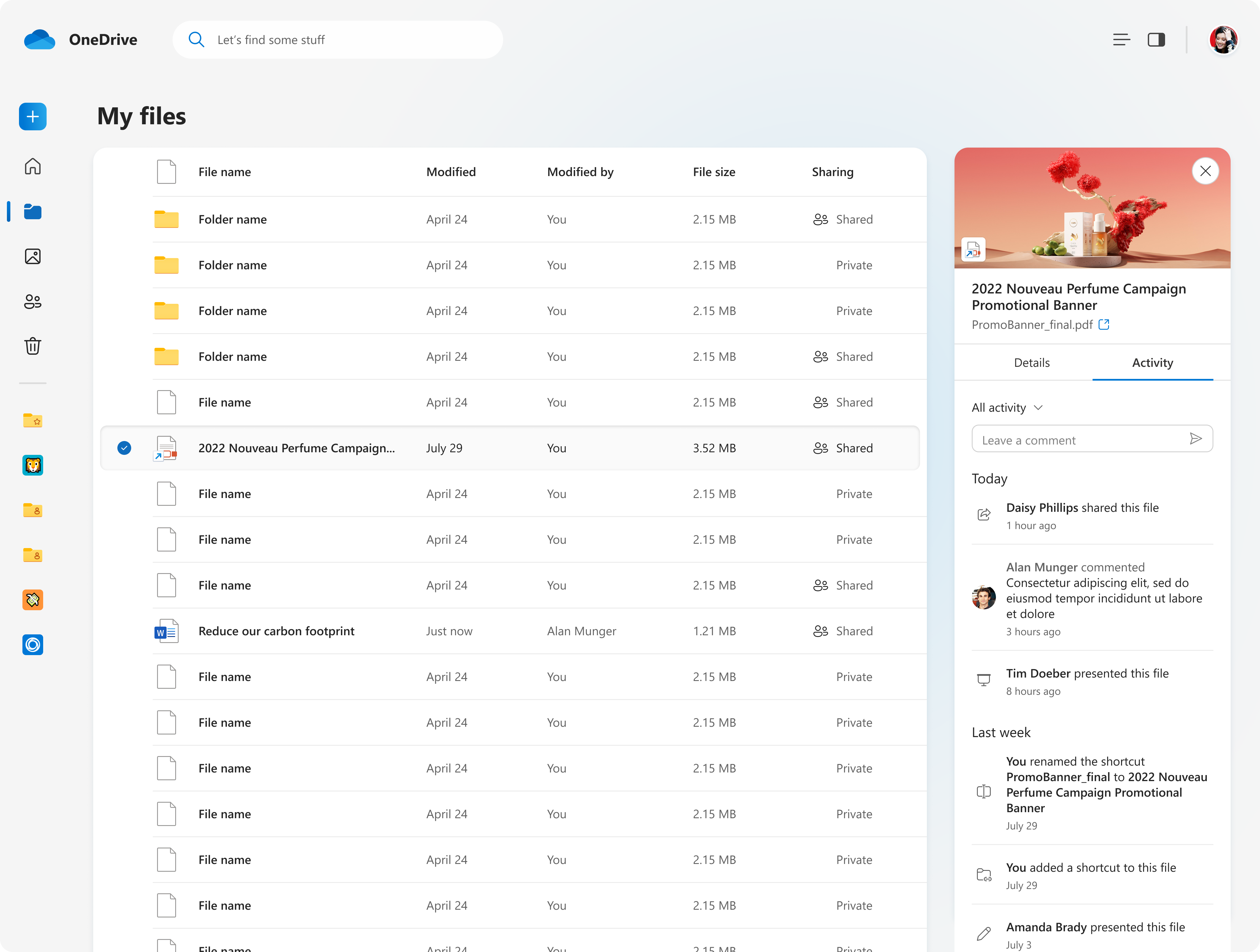
Exploring Use Cases
I then took Option D and explored additional use cases and edge cases to test its scalability and ensure the design held up across different scenarios.
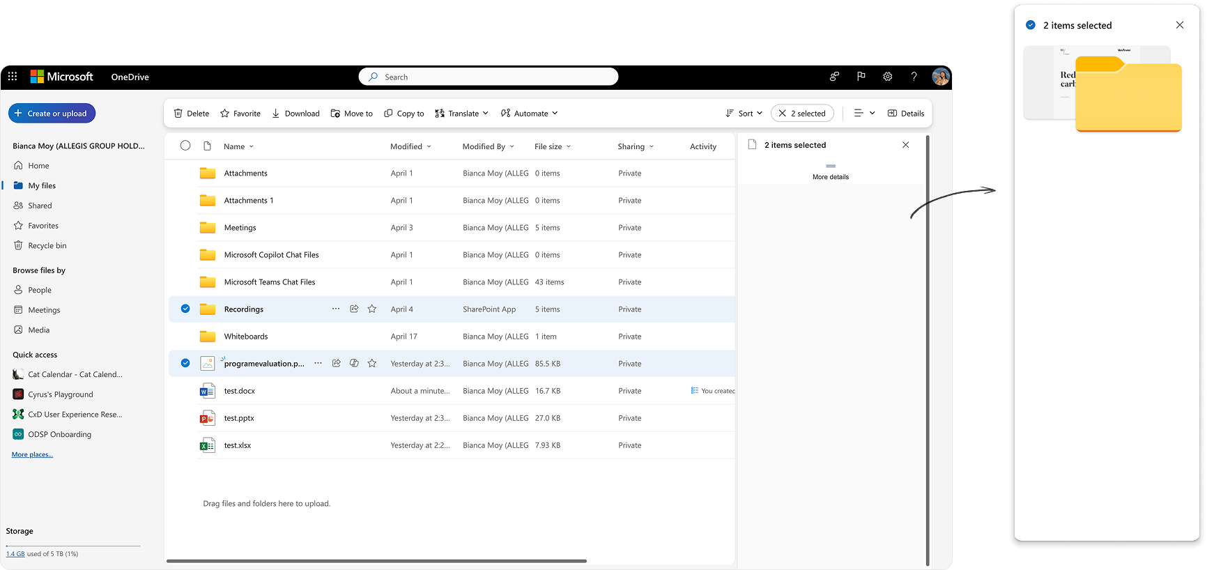
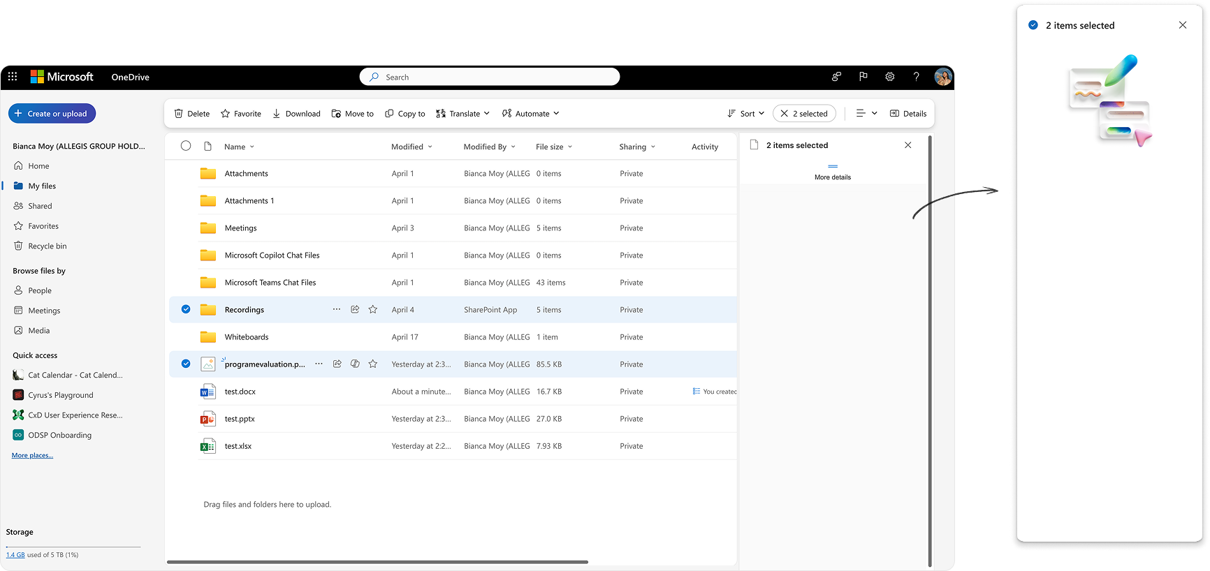
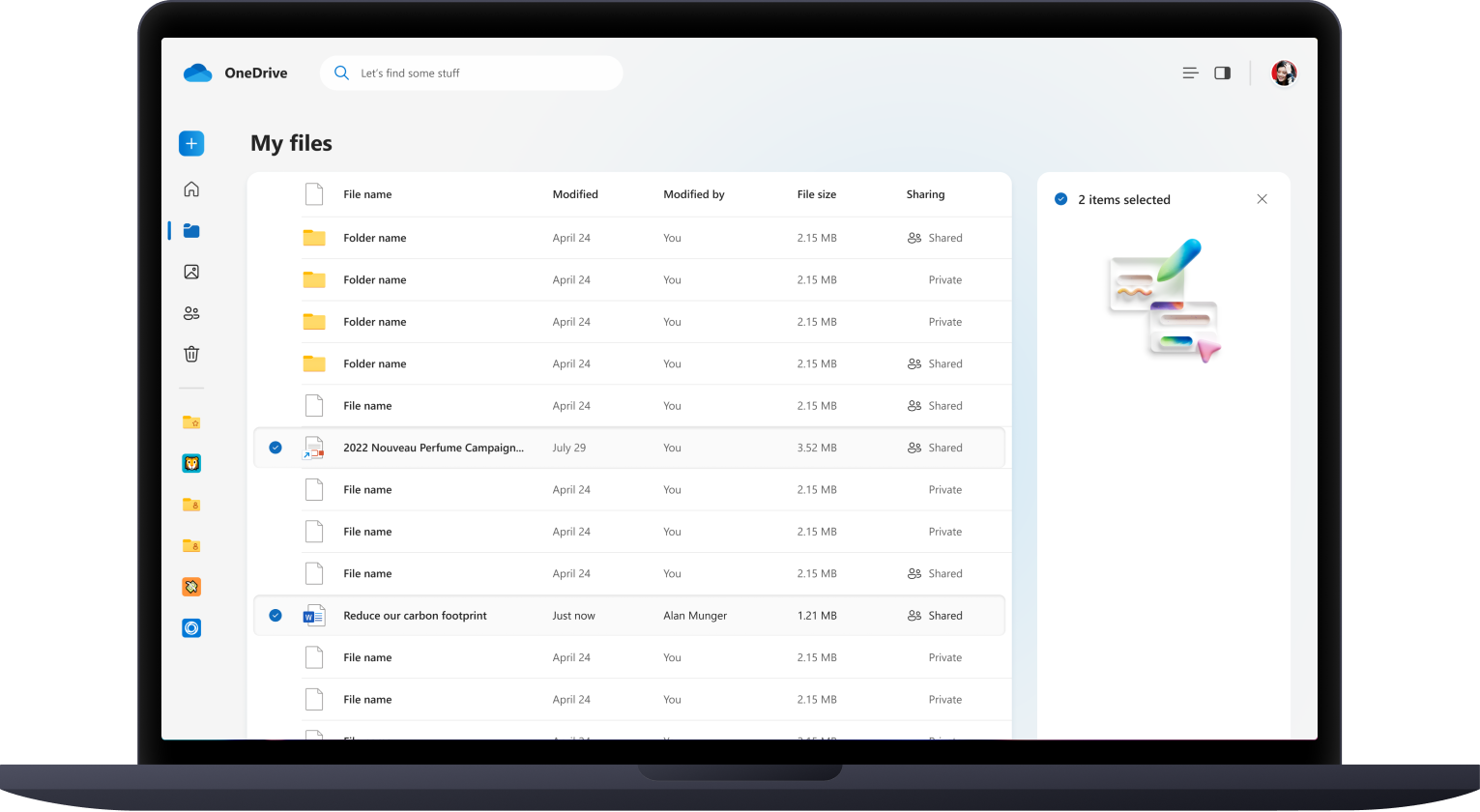
I also explored alternative approaches for selecting multiple files, resulting in Option 1 and Option 2.
Tradeoff:
⚠️ Not optimal for selecting a lot of files
Benefit:
✅ Using an empty state for multi‑file selection keeps the layout cleaner, reduces visual clutter, and avoids implying that details for individual files are accessible in this context.
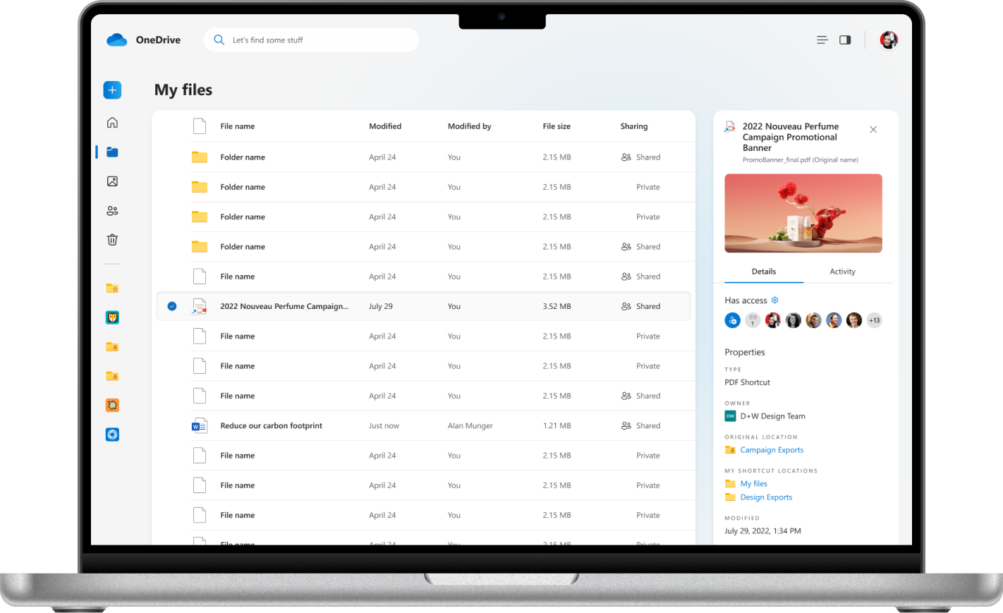
Final Designs
Impact
💥 Shipped the redesigned OneDrive details pane to 300 millions of users across web and desktop, improving visual clarity, hierarchy, and consistency
💥 Contributed to the overall OneDrive modernization efforts, bringing the product closer to Microsoft’s evolving Fluent 2 design system
Reflection
This project marked a meaningful step in my pivot from design systems into feature design. While I didn’t lead user research, I collaborated closely with PMs and engineers to shape the OneDrive details pane experience and push for clarity, consistency, and alignment across the product. It deepened my understanding of end-to-end product delivery—navigating ambiguity, iterating across multiple touchpoints, and designing with impact at scale. I’m excited to continue growing in this space, bringing systems thinking and craft into product experiences that meet real user needs.


